Practical advice on architectural portfolios, representation and applications, from Oliver (Upstairs) and Steven (Show It Better). For students and architects preparing for their next role or a master's. Free, every two weeks.
Two portfolios, one system
|
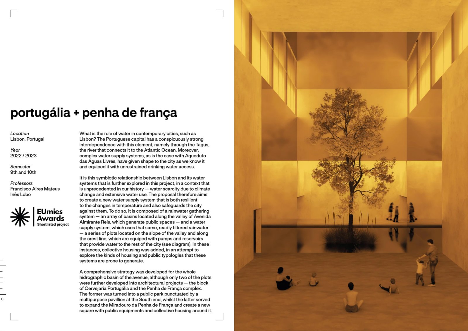
ISSUE 01 · OCTOBER 2026 Hello Reader, Last issue you voted, and "Job or master's" won. It gets its own issue in two weeks. This week we reviewed six portfolios on Show It Better, and two of them show how to make every project feel like part of one portfolio. On the channel · Six portfolios, one systemVicente Mateus built his portfolio to be easy to update with each new project. Every project introduction follows the same pattern: main image on the right, title, description and general info. Sounds obvious. In practice most people place a pile of images or invent a new introduction every time they switch projects. He also put a shortlisted award in his opening project. Buried in the CV, it could easily pass unseen.
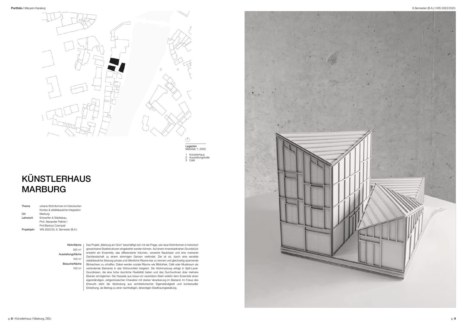
Meryem Karakoc uses the classic project opener, and she executes it well: site plan, main image, title, main info and a bit of text.
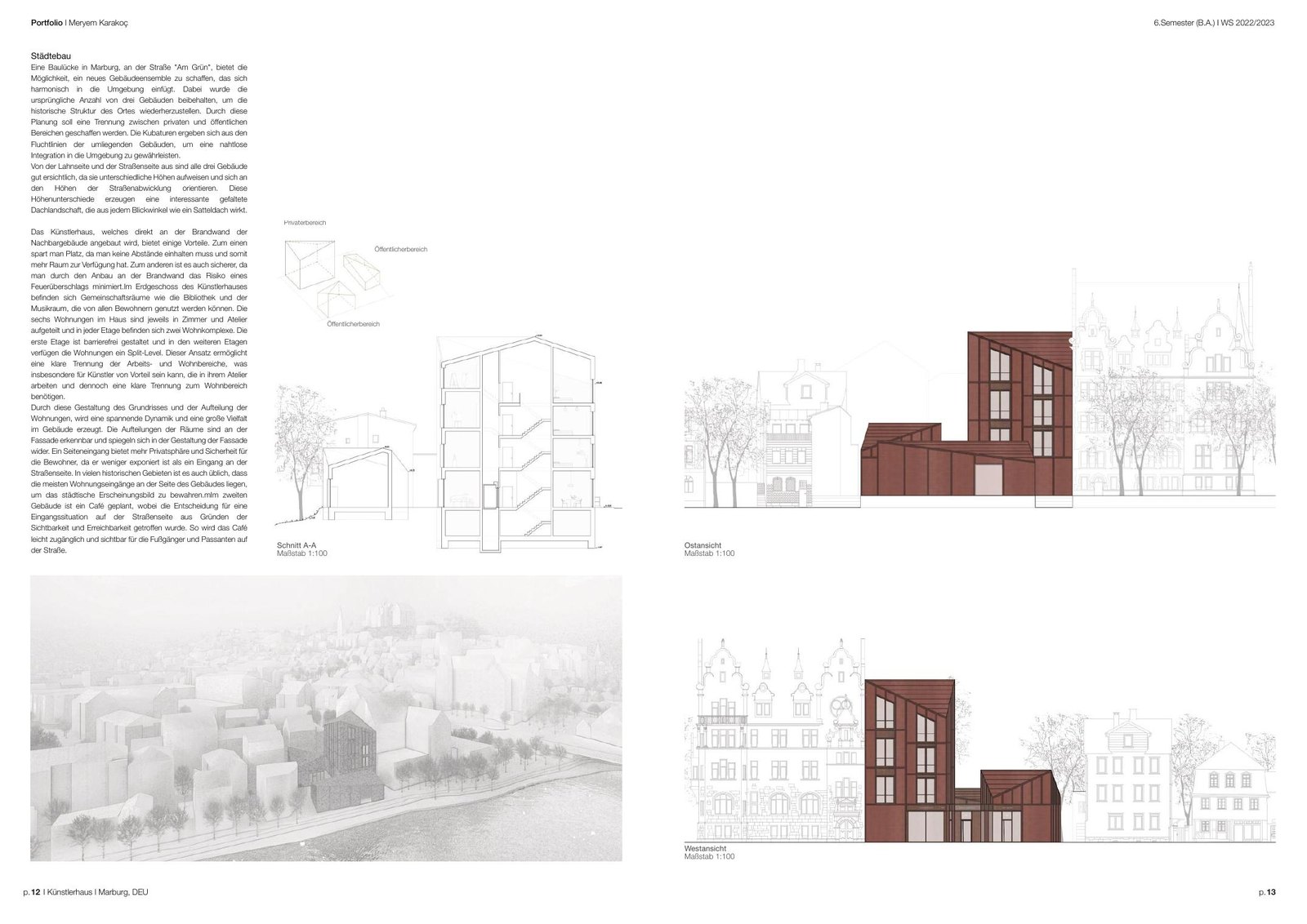
Her first project then runs over five spreads, and the third one is probably the best in the whole portfolio. Red is her main colour throughout, with nothing else competing for attention.
Both of them set the system first and then stuck to it. You can do the same tonight. Write down where your main image sits, where the title goes, which facts you list and your one accent colour. Build it as a master page and use it for every project. If your projects are very different, keep the opener identical and let the pages after it change. Quick fix · How wide is your text?
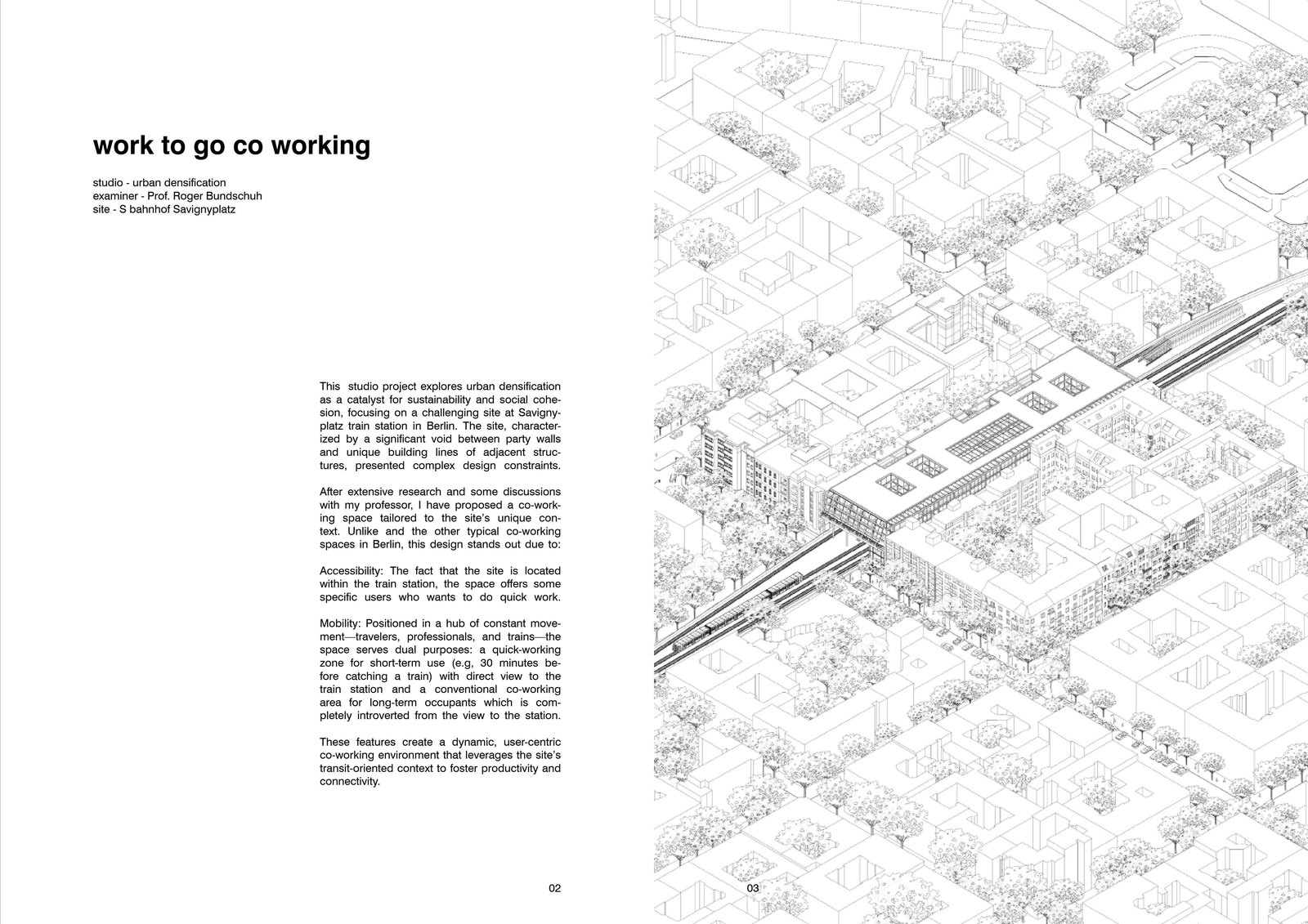
The text columns in Nikhil Sharma's portfolio are narrow, around 45 to 75 characters per line, which is what we recommend in the workshop. They read easily and don't take over the spread. Count the characters in one line of your longest project text. If it goes past 75, make the column narrower and let the text run longer down the page. It takes a few minutes. What we're reading · Humanise
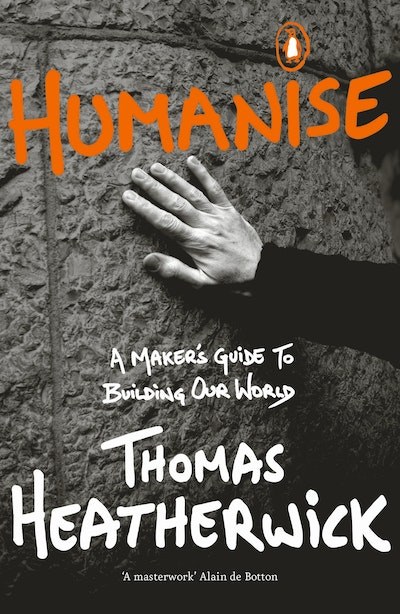
We visited Heatherwick Studio, and it was great to see their work from the outside, in the buildings, and from the inside, in the studio where it gets made. His book Humanise (2023) puts a lot of what we saw into words. It argues that much of what gets built today is boring, a "blandemic" he says leaves people stressed, sick and unhappy. His test is that a building should hold your attention for as long as it takes to walk past it. Try a version of it on your portfolio: show one spread to a friend for 20 seconds, then ask what they remember. If they can't name the project, your opener is hiding it. Next issue · Job or master'sWhat changes in the portfolio when you apply for a job, and what changes when you apply for a master's. You picked it, and it's coming in two weeks. If you're applying for one of them now, reply and tell us which one, and the part you're least sure about. We'll answer as many as we can in that issue.
|
The Portfolio Note
Practical advice on architectural portfolios, representation and applications, from Oliver (Upstairs) and Steven (Show It Better). For students and architects preparing for their next role or a master's. Free, every two weeks.