Practical advice on architectural portfolios, representation and applications, from Oliver (Upstairs) and Steven (Show It Better). For students and architects preparing for their next role or a master's. Free, every two weeks.
Your work is not as small as it feels
|
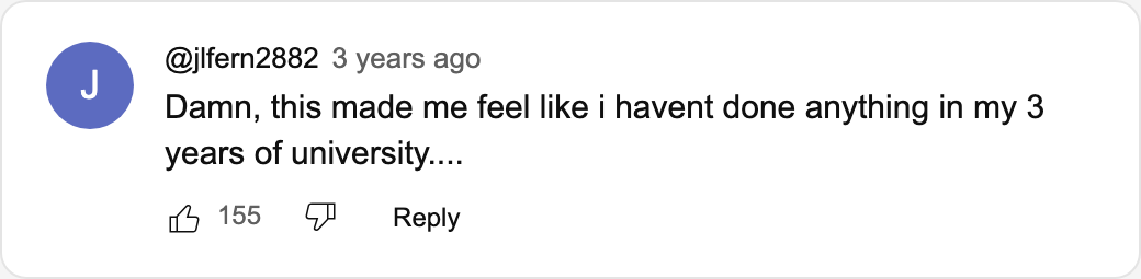
ISSUE 00 · OCTOBER 2026 Hello Reader, This is the first issue of The Portfolio Note. We've talked about architecture portfolios on camera for years, and lived with the weird rules of YouTube. Now we want a more direct line to you: a place where we can say exactly what we think, share what we're reading and bring back the comments that stayed with us. We've been reviewing portfolios for over five years, so we already have a lot planned. We'll start with a comment left under one of our review videos, about three years ago:
155 people liked it, and we get why. When you watch one strong portfolio after another, from people with very different backgrounds, your own work starts to feel small, even when it isn't. The gap between those portfolios and yours mostly comes down to a few decisions: what to show, and how to show it. That's what we'll write about here, every two weeks. Feel free to hold us accountable if we miss one. At the end of this issue, you get to pick the topic of the next one. On the channel · Good vs bad portfoliosFor our Good vs Bad video, and our long-awaited comeback, we read about 200 portfolios. Recruiters and professors are in the same position we were in: a pile of applications, and about 20 seconds for each one. 30 if you're lucky. Take white space. Vincent Karlsson keeps his pages very simple, and it works. Renderings, line drawings, diagrams and full images are in balance, there is no symmetry, and something always breaks the pattern, in a good way. Mai Bandem goes maximalist, and that works too. Her pages are dense but full of character. They read like a good zine: packed and still completely under control. Both of them decide where the white space goes. They just spend it differently. If you're unsure, go simple. A minimal portfolio is easier to get right than a maximalist one. Worth your time · A portfolio we keep going back to
When it comes to hierarchy, Paul Martinez has some of the best spreads we've seen. There is always a clear focus, and he makes the most of the wide spread. His opening for Casa Deportiva Cumbre Alta is outstanding: one wide rendering across both pages, and a small black section drawing in the top right corner. His plans are tiny, but the cut walls are filled in and everything else is light grey line work, so you still understand the space. Definitely one of our favorites. Flip through Paul's portfolio on Issuu What we're reading · Elements of Architecture
For the 2014 Venice Biennale, Rem Koolhaas and his team split the building into 15 elements: floor, wall, stair, toilet, ramp and ten more. Taschen published the research as one gigantic book in 2018. We've been reading it and loving it. It's also surprisingly funny. If you like OMA's work, you have to check it out: Next issue · You pick the topicThese are three problems you keep asking about in the comments. The one with the most votes becomes the next Note. Tap one to vote, or reply and tell us yours: → Making all your projects feel like one portfolio → Fitting it all into 5 pages or 2MB → Job or master's: what changes in the portfolio
|


The Portfolio Note
Practical advice on architectural portfolios, representation and applications, from Oliver (Upstairs) and Steven (Show It Better). For students and architects preparing for their next role or a master's. Free, every two weeks.